A Contemporary Reno transforms a 1970s Oak Bay time capsule into a home for the ages.
BY DAVID LENNAM | PHOTOS BY DASHA ARMSTRONG
Some say the often derided split-level house — seemingly stuck in a 1970s Brady Bunch time warp — actually belongs in the stylistic oeuvre of the much-lauded mid-century modern.
Perhaps with that as their inspiration, Jamie and Jesse Gough managed to look beyond the tepid curb appeal of a South Oak Bay run-of-the-mill split-level to imagine a wide-open, light-filled space with room for their family of four (plus mum) that embraced the patina of coveted mid-century modern.
Though not without some trepidation.

“When I first saw it, I wasn’t really interested,” says Jesse. “The outside still looked like 1969. I didn’t love [it] and I told Jamie I didn’t want to buy the house.”
Like any typical split-level, it was bland, pale yellow, with a church-like, A-frame roof over the front entrance. Yet the lot was impressively large and the attached carport could become an enclosed garage.
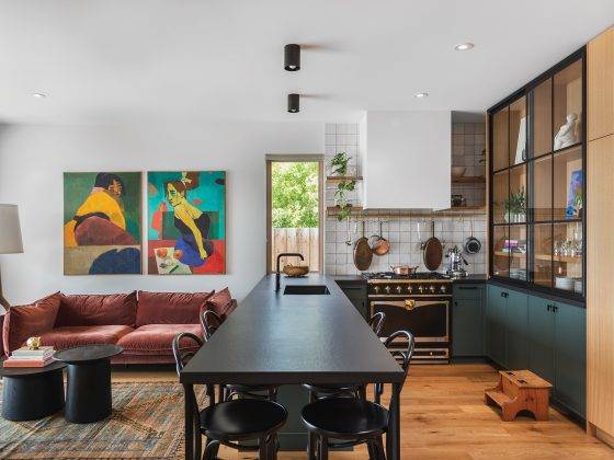
The home was owned by a contractor who was creating a spec project for resale and extensive structural alterations to the interior had already been made, releasing the building from its dated esthetic. Walls had been removed, large windows and sliding glass doors installed, and stylish millwork was brought into the brand-new kitchen and bathrooms.
Enter interior designer Raubyn Rothschild of Rothschild West Design + Planning. She fully understood the limitations of the house plan, but she saw strong bones and the contractor’s substantial re-fit as groundwork for her client’s desire to fashion a residence with more than a nod to mid-century modern style.
“Split-levels are one of the trickiest ones to revamp and rethink,” explains Rothschild. “They’re so specific; everyone knows them and there’s not a lot of innate charm in them.”


Her clients wanted comfortable and livable, but also relevant and fresh. So Rothschild went to work on the nearly 3,000-square-foot home, first removing several features the contractor had installed and reconfiguring much of the lower level to outfit a suite for Jamie’s mother.
Topping the Goughs’ wishlist was one big, open-concept space — a refined and streamlined, sink-into-the-couch area, but one that would be hardy enough to handle their two youngsters.
“That’s a little tricky sometimes, when a bunch of kids are running around,” says Rothschild, who makes it her mission to weave “hard-wearing” into sophisticated adult spaces.


The end result is roomy but cozy: an upper floor with a spacious, airy open plan for the living/dining/kitchen area, plus three bedrooms and two bathrooms. Downstairs features a family room, guest bedroom, garage/workout room and a full suite.
“In some new builds the rooms are so big you have a lot of empty space between the zones,” says Rothschild. “This one shows you can still have a modest footprint and the spaces still feel distinct, but it feels cozy.”
Furniture was purposefully chosen for the new house to emphasize the function of each area without crowding.
“Raubyn really helped define the spaces of the open-plan main room,” says Jamie. “It’s got some flow to it, but there are definitely specific spaces.”
She loves how the whole family can hang out around the sizable kitchen island — the kids doing homework, mum and dad cooking, or all enjoying daily family happy hour.


“It doesn’t feel like there are too many people when we’re all up here doing our thing,” says Jamie. “That’s nice.”
The Goughs got their mid-century flourishes in the bleached, engineered oak hardwood floors and neutral colour palette, as well as the low-profile furniture that doesn’t obstruct sightlines or sunshine and a blend of organic textures and materials — wood, stone, fabric, even the sheepskin accent cushions on dining room chairs.
For Rothschild, the nod to the clients’ yen for this style was a subtle one.
“This home doesn’t scream mid-century; it’s just some of the long, lean lines, the simplicity, the use of natural materials and light. And not trying to be too showy.”
She says, adding with a laugh, “There’s no teak in there.”